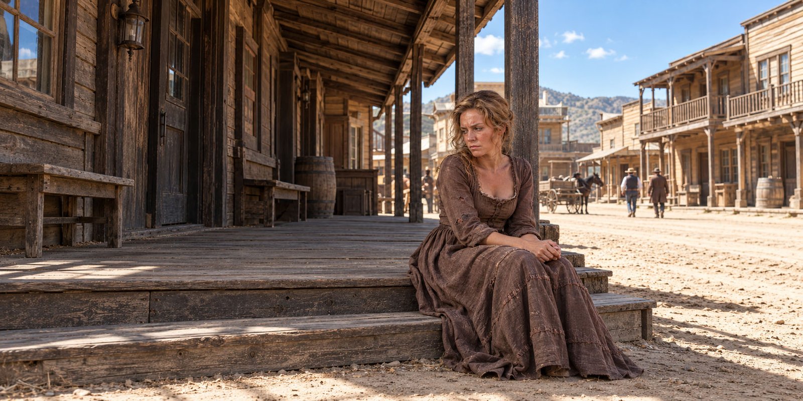





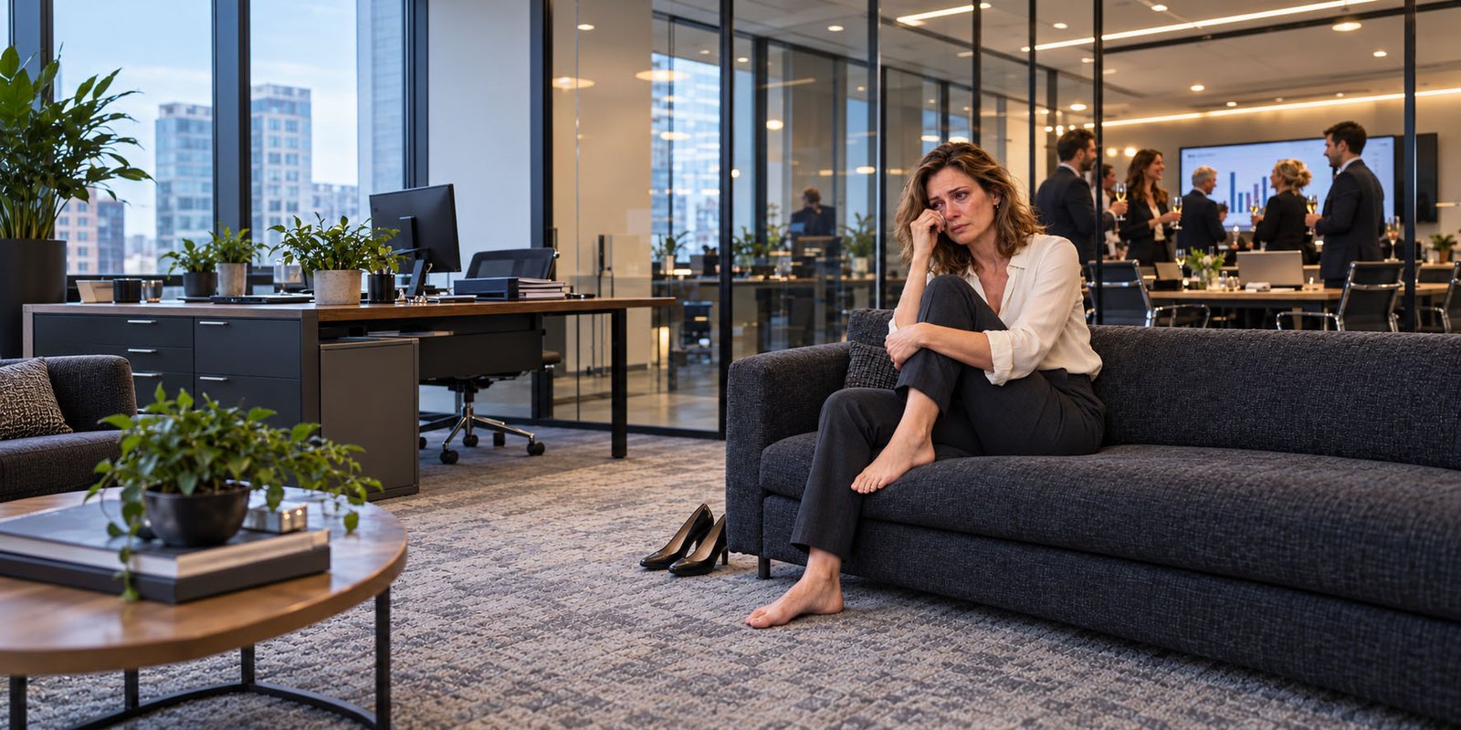

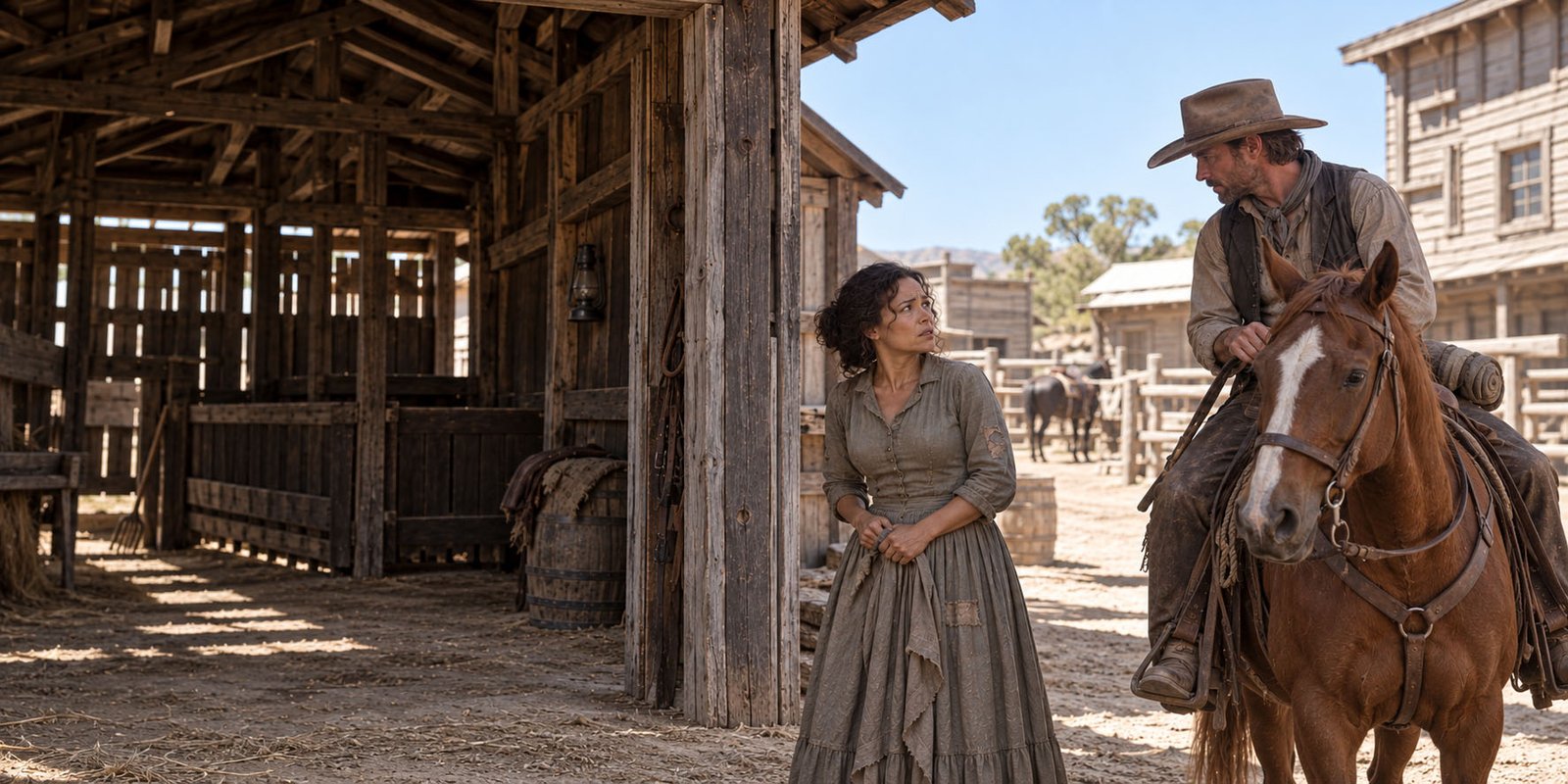

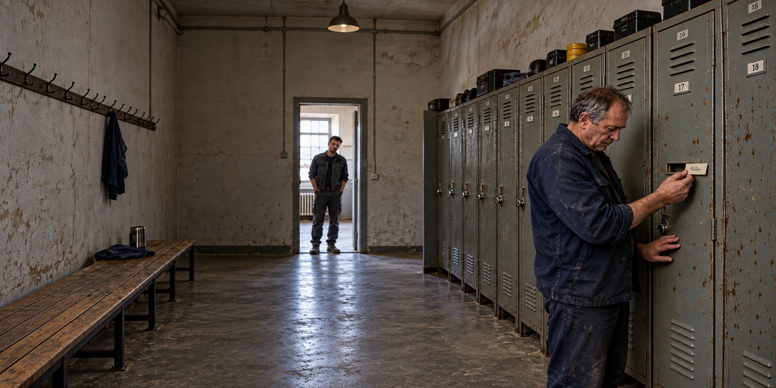

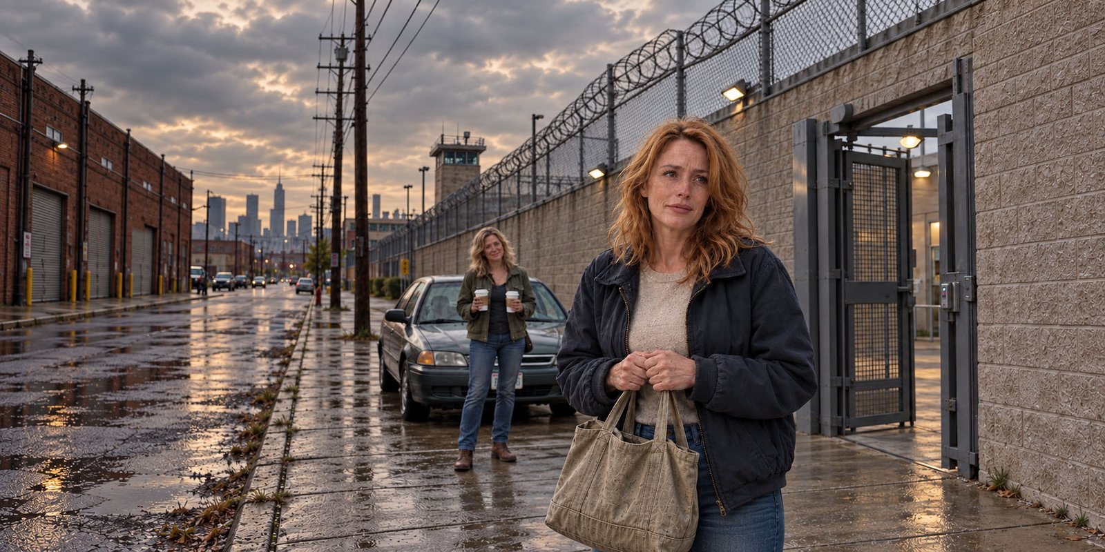

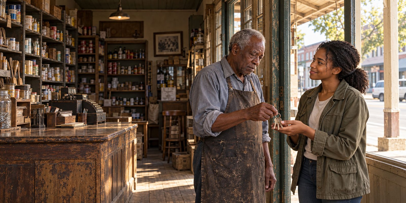

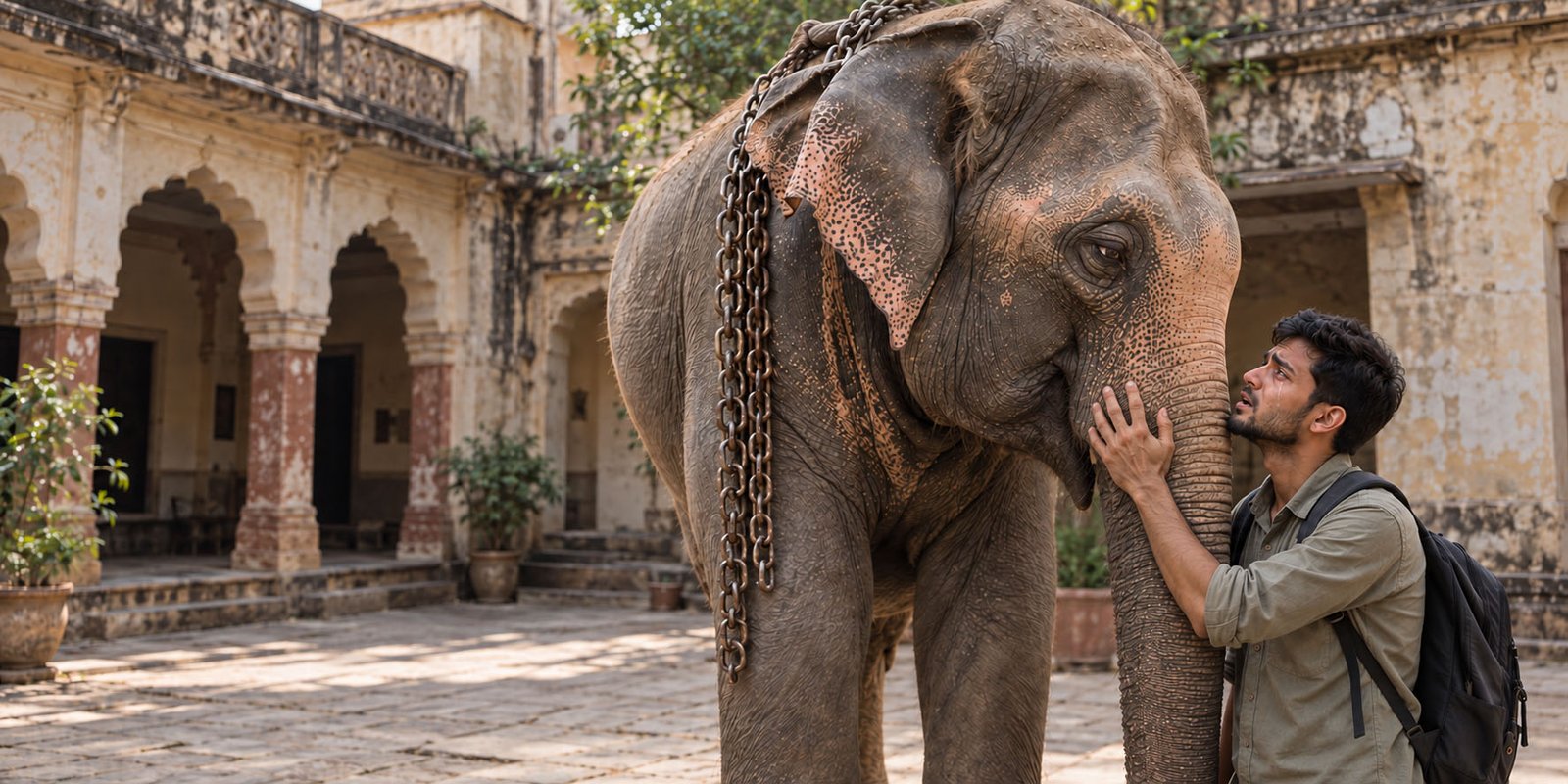
Every image below is a starting point for your own creation. Click one to open its complete prompt, reference images, and settings in the image editor. Explore how it was made, then change the details to bring your own vision to life.
Explore and edit freely. Sign in when you’re ready to generate.
Start with an example. Create something of your own.
Change an expression, choose a different setting, or add your own reference images. Each example gives you a starting point — where the story goes is up to you. Ready to bring your ideas to life? Sign in and create.
Creativity,
in another dimension.
Experience a new depth of design.
Good questions.
Beautiful answers.
Open a question. Discover what is underneath.
6 questions
3D FAQ combines familiar question-and-answer navigation with layered glass cards. Select a question to open its answer.
This is editable demo content. Replace it with the questions your visitors actually ask.
Link to this answer ↗Use the search field to look through both questions and answer text. Topic filters narrow the results further.
Try searching for editor: the matching question is found even when the answer is closed. Use Reset search to restore every question.
Link to this answer ↗Each module instance can use its own Design Preset, layout, content and effect settings.
Apply the built-in Nebula, Glacier or Champagne design, customise it, then save your own preset. Existing modules retain their applied settings when a saved preset changes.
Link to this answer ↗An open answer stays still. Its card stops following the pointer, so the text is easier to read and its links are easier to use.
The light and separated glass layers can remain visible. You can also turn motion or living light off entirely. Reduced-motion preferences are respected.
Try the Separate layers control, then open and close a card.
Link to this answer ↗Use your configured Joomla editor to format answers, header and footer content. Questions stay plain text for predictable headings and searching.
- Paragraphs, emphasis and lists
- Links and images with alternative text
- Copy, edit, publish and reorder questions
Replace this answer with your own content and links.
Link to this answer ↗The layout responds to the width of the module, not just the width of the screen. A sidebar can use one column while a wide section uses three.
Answers grow naturally. On touch devices the page scrolls normally; no hover or card-flip gesture is required to read an answer.
Both layouts in this demo use the same questions and answers.
Link to this answer ↗No answers found.
Try a different phrase, or clear the topic filter.
